Fizz
2025
Building trust into the college resale experience
As Design Lead, I managed and mentored a team of designers while driving two core experiences in Fizz Marketplace: a redesigned Explore page that simplified discovery and a streamlined listing flow that made selling easier.
Overview
Making campus resale feel effortless
For many college students, Fizz Marketplace is the one of first places they look when moving in, moving out, or searching for affordable essentials on campus. But despite its active community, the experience often felt overwhelming. Important information was buried, discovery required excessive scrolling, and creating a listing involved more work than necessary.
The Impact
Our redesign focused on making the marketplace feel intuitive from both sides. I led the redesign of the Explore experience and seller listing flow, helping students browse with greater confidence while making it easier for sellers to share their items.
Problem
An experience that slowed busy students down
What should have been a quick, effortless experience often felt unnecessarily demanding. Students had to sift through cluttered listings, hunt for important details, and piece together enough information to decide if an item was worth messaging about. Meanwhile, sellers faced a long, cumbersome listing process that required excessive effort with little support along the way.

01 - Inconsistant Color, 02 - Weak Hierarchy, 03 - Low Visibility, 04 - Long Listing Fow
Research
Looking beyond the numbers
To better understand where friction appeared across the interface and to understand where students struggled most, we interviewed marketplace users and analyzed existing browsing behaviors. While everyone's shopping habits differed, four themes consistently emerged.

What we learned
Through interviews and workflow analysis, I identified these recurring patterns and actions:
Trust comes first → redesigned listing cards & details
Discovery felt overwhelming → redesigned Explore page
Selling required too much effort → redesigned listing creation flow

Ideation
Exploring interface directions
To get the brain juices flowing, we facilitated a team brainstorm and sketching session to generate, critique, and refine ideas for improving item discovery and the seller experience. Below are the features that I specifically worked on:

Exploring different features focused on hierarchy, visibility, and clearer flow on both sides.
Testing interaction flows early
Before moving into high-fidelity designs, I tested early interaction flows using low-fidelity prototypes. These quick sessions helped validate smaller navigation patterns, and layout hierarchy before investing time into polished UI design.
Cleaner structure through product cards
I began by exploring multiple product card designs to elevate the standard, plain layout of the current interface. My choices were guided by how clearly and effectively the information was presented.

01 - Chosen for readability, organization and relevance.
AI personalization browsing experience
The current interface offers little opportunity for personalization and limited ways for the app to engage users beyond basic filtering and item layout. In my redesign, I addressed this by introducing discounts and personalized browsing. By interacting with a product card, users can view items with recent price drops as well as a curated list of recommendations based on their previous activity.

Creating a more visible listing page
To explore the listing experience and explore page layout, I tested various iterations, including the three presented below. After evaluating these options based on usability, I chose version 3. This design balanced seller efficiency with the dual buyer–seller nature of users, making selling feel lightweight, accessible, and repeatable.


02 - Chosen

Multi-Page Listing Process to relieve cognitive load
To address the pain point of cognitive overload while creating a listing, I saw the opportunity to design a flow that separates the tasks to different pages. This allows users to automatically focus on one task at a time, while also knowing ahead how many pages they need to go through.

01 - Pictures, 02 - Description & Filters, 03 - Price, 04 - Overview, 05 - Submit
Of course, the work is not done yet because I thought that there needed to be another round of iteration and refinement with the visual craft. This time, I was making sure to stick more strictly to the design system document.
Designs
Refining the design further
The final redesign focused on making campus buying and selling feel more effortless through clearer information hierarchy, streamlined listing creation, and a more intuitive Explore experience. The updated interface made listings easier to evaluate, items easier to discover, and selling faster from start to finish.
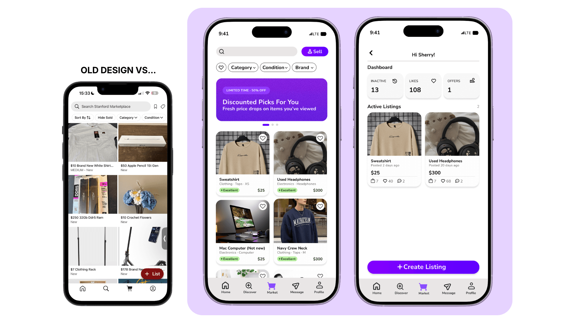
Landing Page - Consistent Brand Colors, New Discovery, Modern UI

Listing Process - Multi-Page, Clear and controled structure
Lessons
Designing for clarity, confidence, and trustworthy workflows
Good designs guide users
This project reinforced that good design should empower users instead of limiting them to only a few, directed choices. Rather than prescribing actions, design should guide users toward making informed decisions. For both shoppers and sellers, the experience succeeds when decisions feel clear, confident, and seamless.
Building products requires PM skills
Big projects with big ambitions/ideas behind them are built faster when there's a streamlined and organized way to distribute work, view/edit timelines, hold accountability, and meet deadlines. I found that I was the one who had to monitor and manage the group's calendar and expectations throughout this project. It taught me that being a good designer also meant being comfortable leading people through different parts of the project for a smoother building time.

