Stanford A3C
2024
Creating a visual design system
Developed marketing campaigns and audience-facing content for campus programs and built a scalable content production system that doubled output and reduced design time
Overview
Designing a visual identity for a thriving campus community
As Stanford's Asian American Activities Center grew its programming for the 4000+ Asian American students on campus, each event was competing for students' attention with inconsistent branding and time-consuming design workflows. With dozens of events to promote each quarter, creating graphics from scratch was both time-consuming and inconsistent.
By developing a reusable library of templates and visual guidelines, I set out to create a cohesive and recognizable visual system that could scale across dozens of diverse events and cultural considerations.
Research
Understanding each program
Before creating a unified visual system, I first needed to understand what made each of the 14 program unique. I met with program leads to learn about their audiences, goals, and personalities.
Speaker Series
Grad Life
iLive
AIM Mentorship Program
Issues & Advocacy
Asian American Studies
Asian American Sib (AASib) Program
A3C VSO Retreats
Education Pipeline Programs
Asian American Awards Ceremony
Asian American Graduation Celebration
Asian American New Student Orientation
Asian American & Pasifika Heritage Month
Asian American Admit Weekend
Rather than applying just one visual style across every initiative, I identified the key characteristics that defined each program before translating them into a cohesive design language.
Now, how do I still make sure it's recognized as an A3C event?
The solution wasn't a single visual style, but a flexible design system around the center piece (event) that balanced consistency with creative freedom.
Ideation
Creating cohesive design elements
To solve the last question, I had to decide what elements should stay consistent across any design despite the event. The opportunity areas were things like the border, font, main colors, and headers & footers.

Moving to design the unique elements for each event
Speaker Series
A professional audience called for a clean, editorial aesthetic. I used structured layouts, restrained color palettes, and bold typography to establish credibility while keeping guest speakers as the visual focus.
Grad Life
To foster a sense of belonging among graduate students, I leaned into softer colors, welcoming imagery, and relaxed layouts that emphasized community over formality.
Asian American New Student Orientation (or AASib)
The visual language focused on warmth and approachability. Bright colors, playful illustrations, and friendly compositions helped communicate that new students were joining a welcoming community rather than simply attending another campus event.
And so much more…


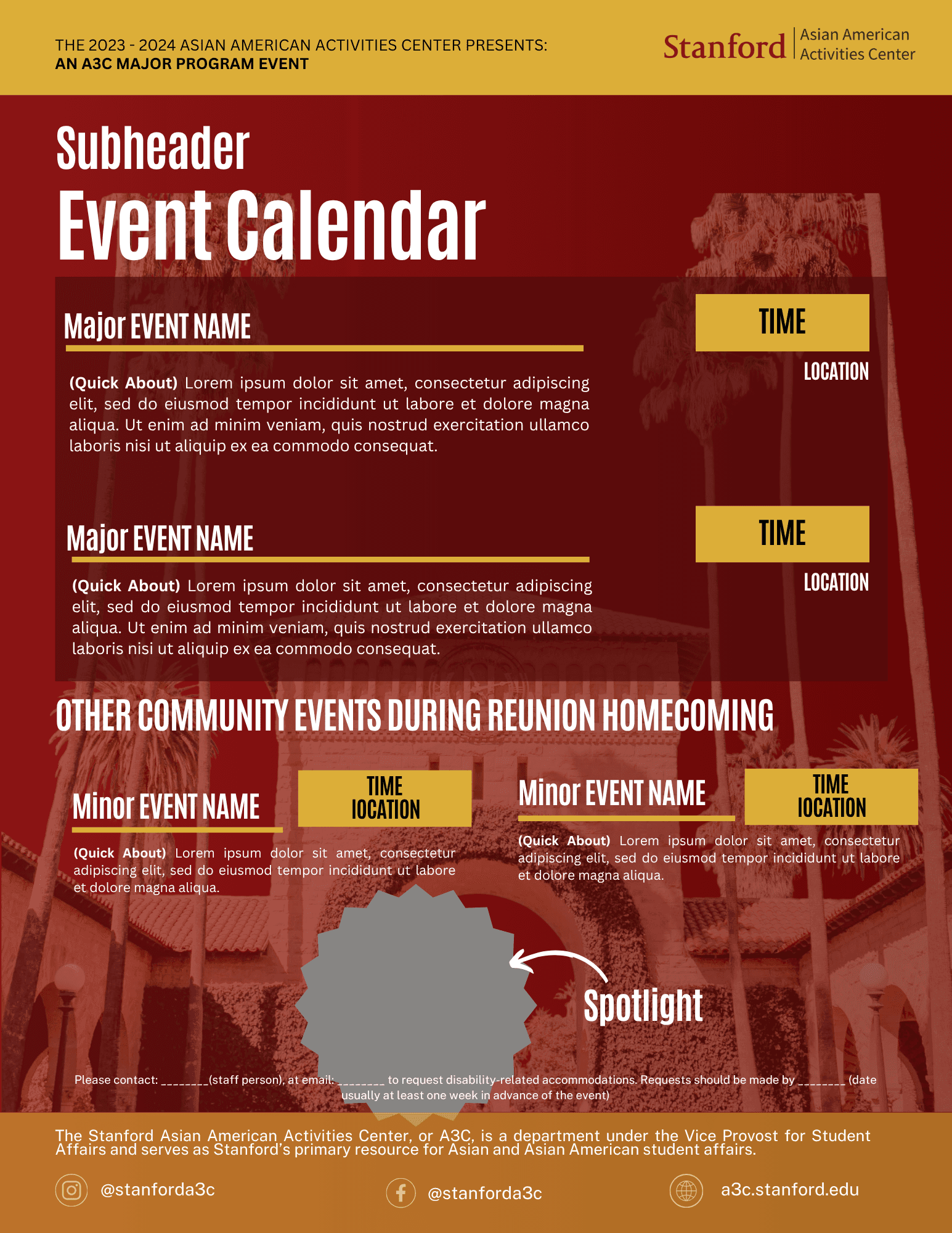

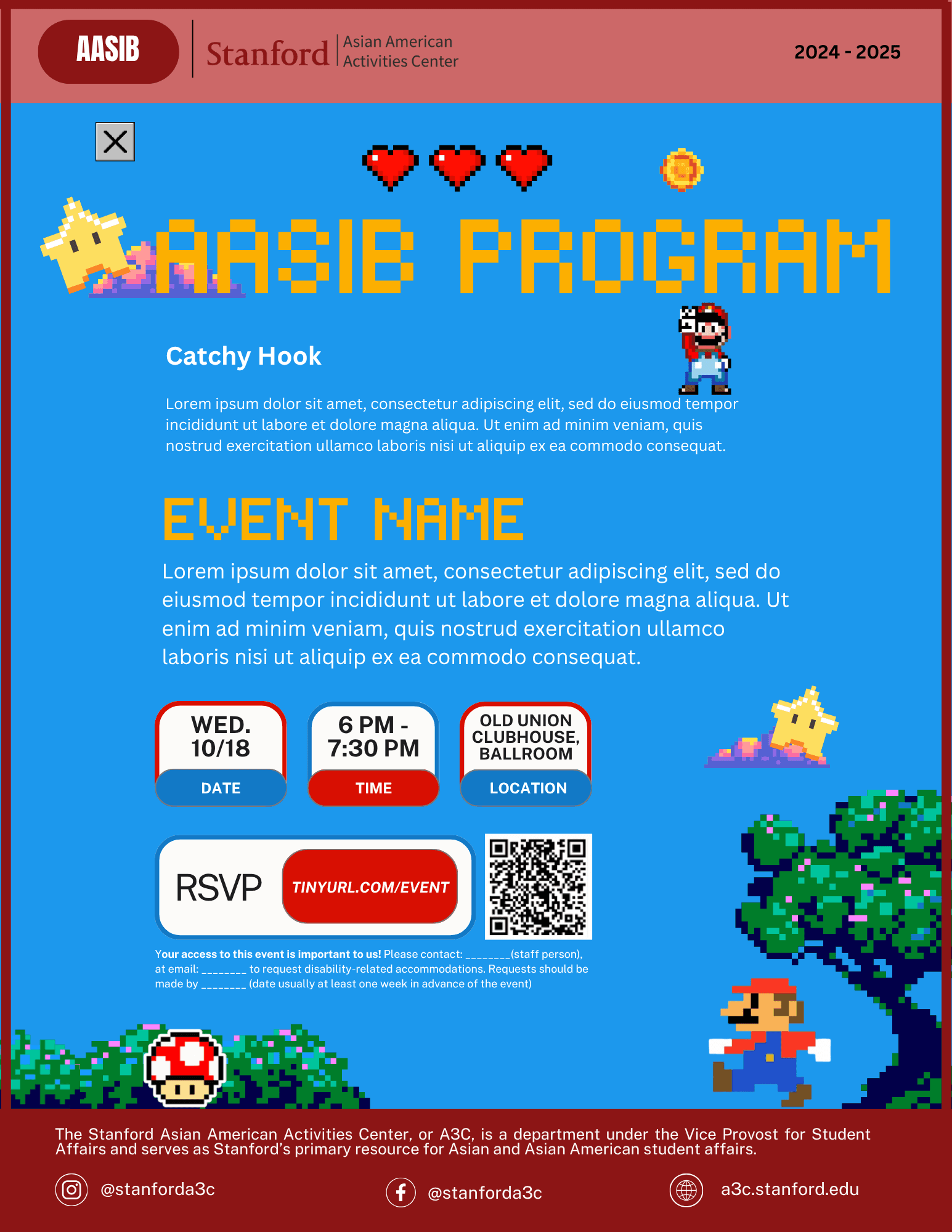
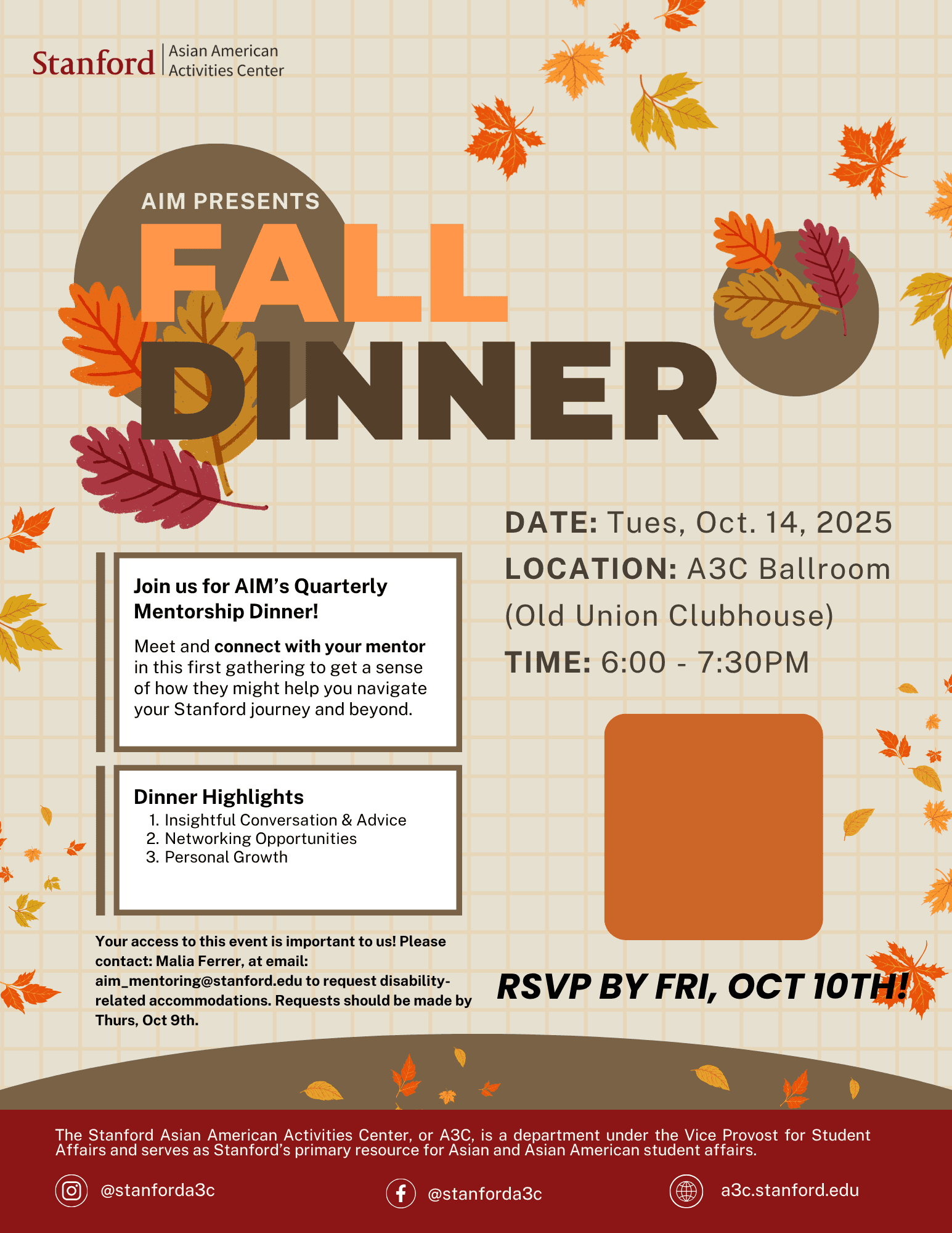
Designs
Bringing the brand together
The final design system gave every A3C program its own visual personality while maintaining a cohesive organizational identity. Rather than relying on one rigid template, the system established consistent design principles:
Designed for recognition
Designed for flexibility
Designed to scale


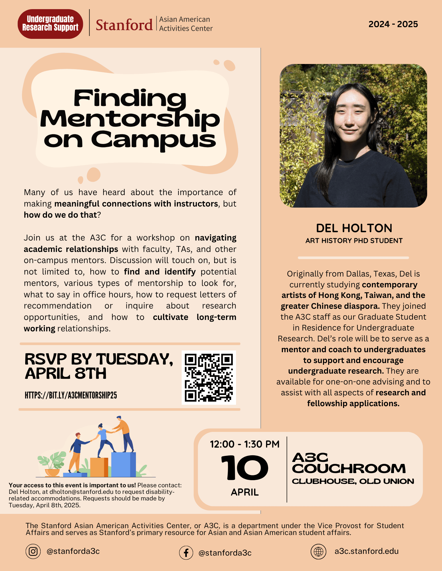


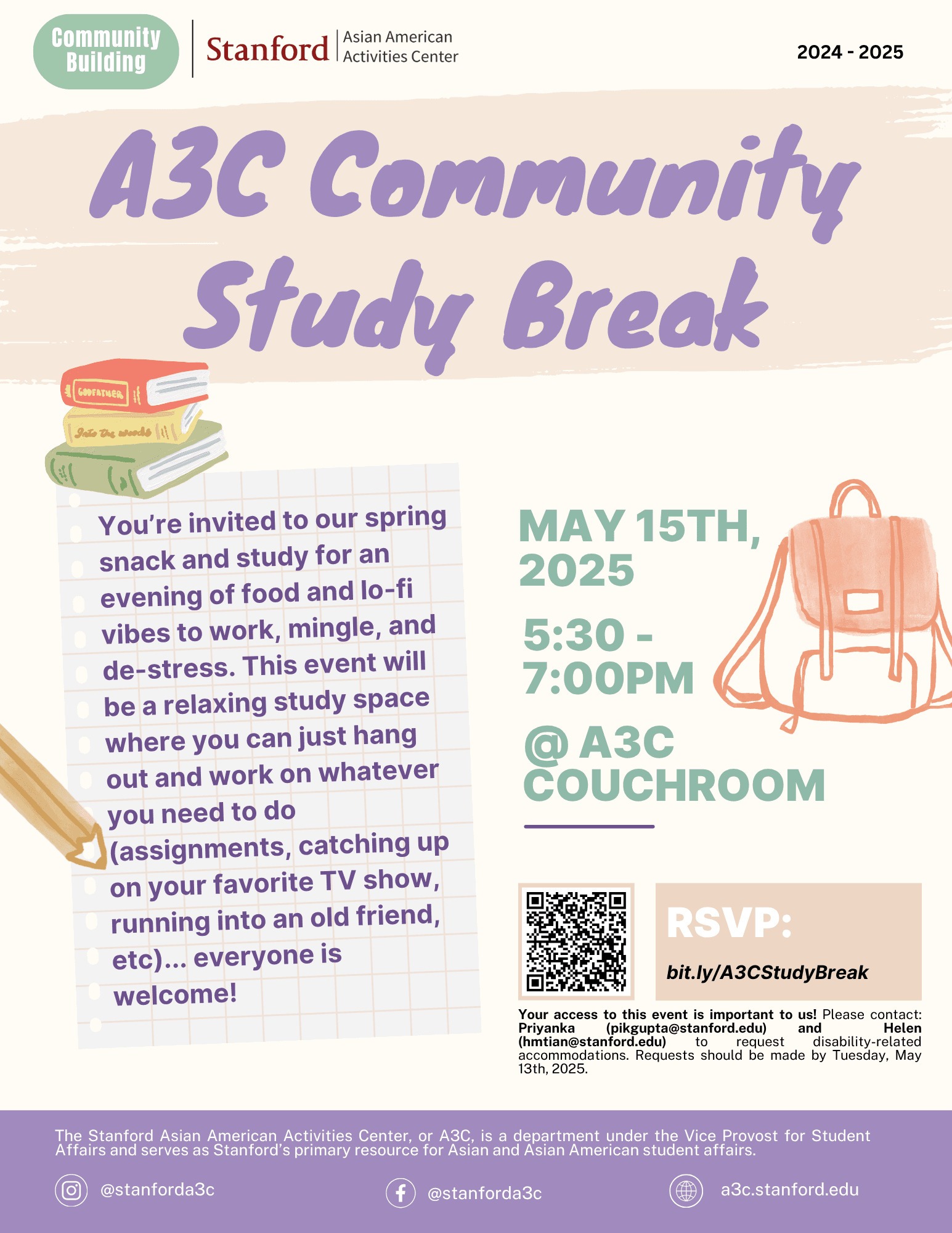
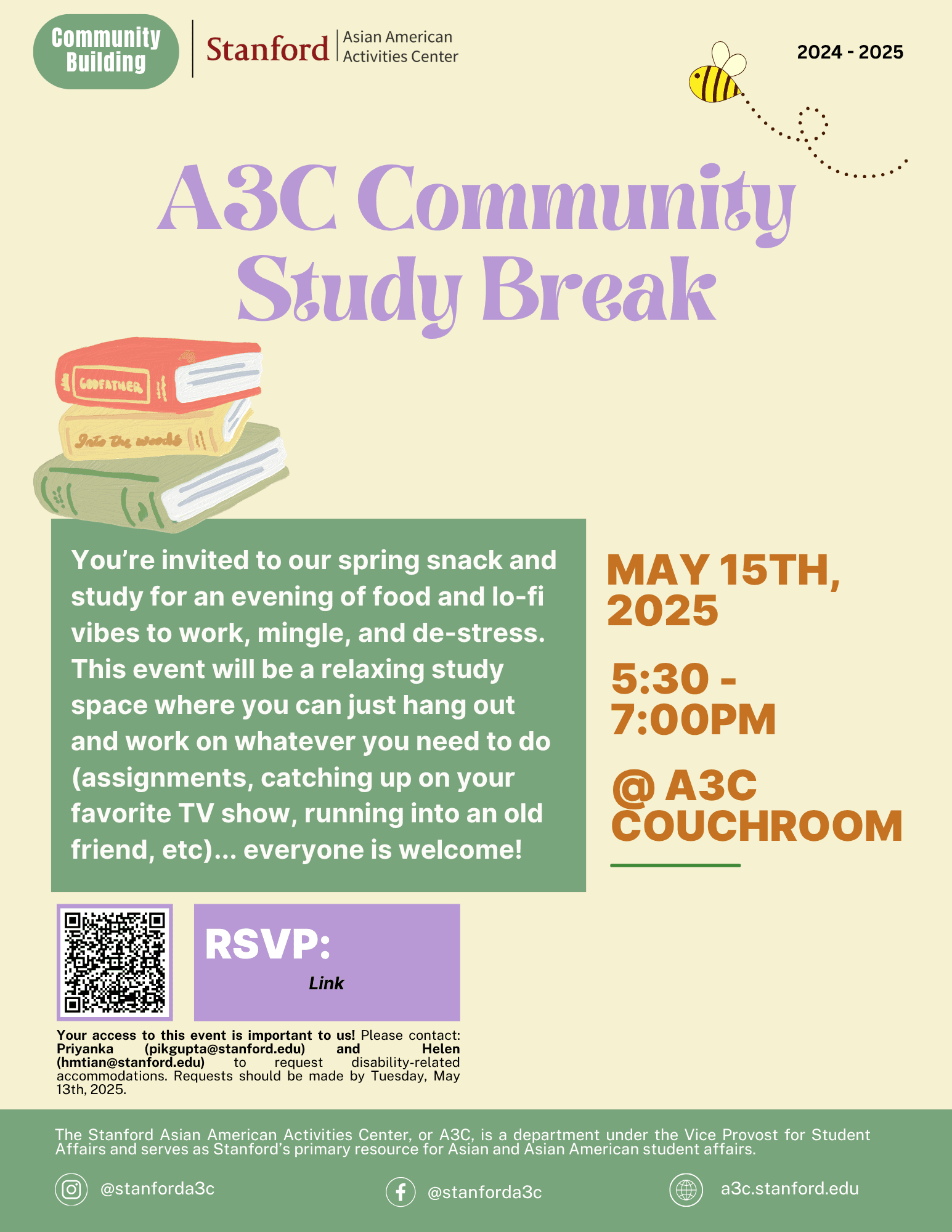


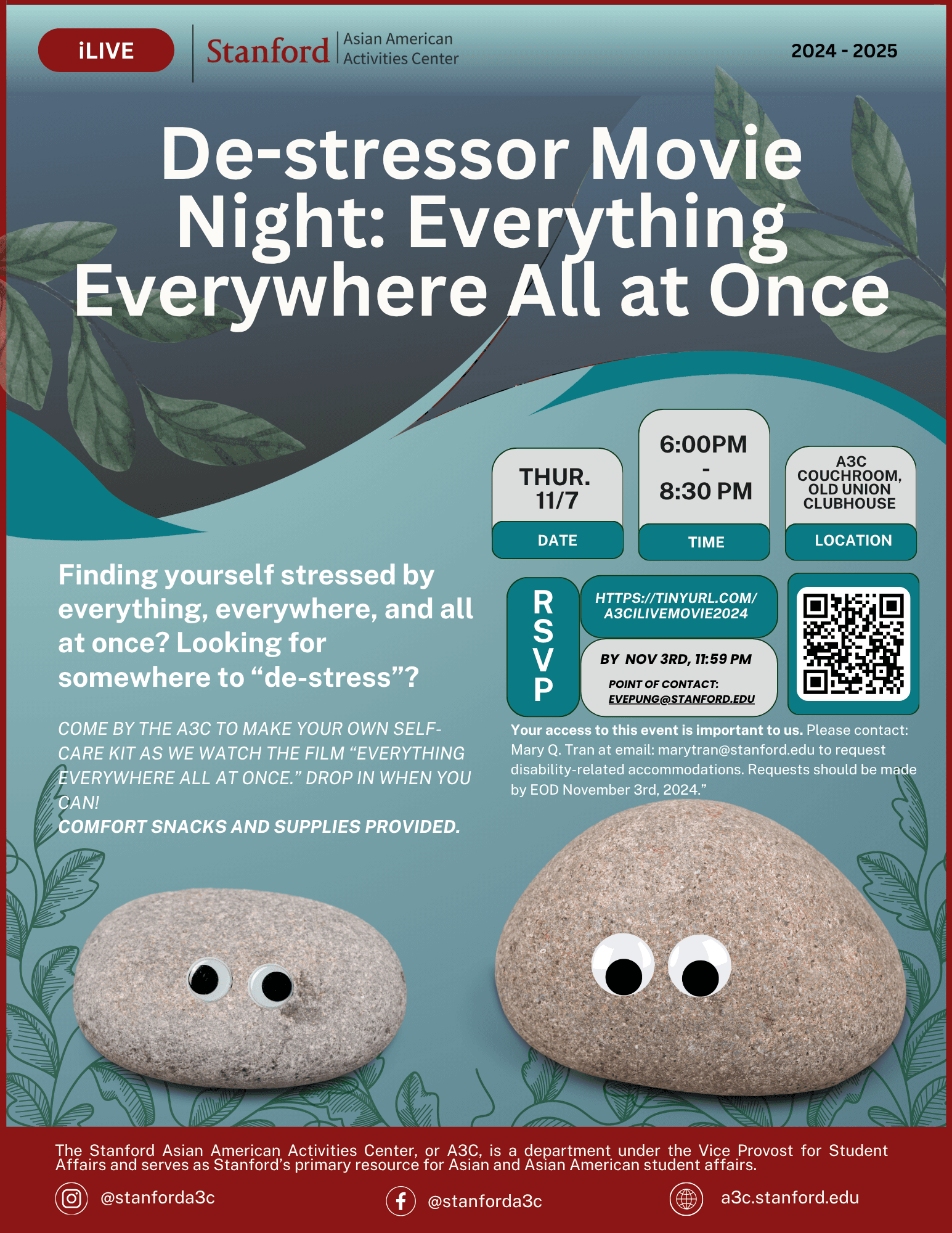
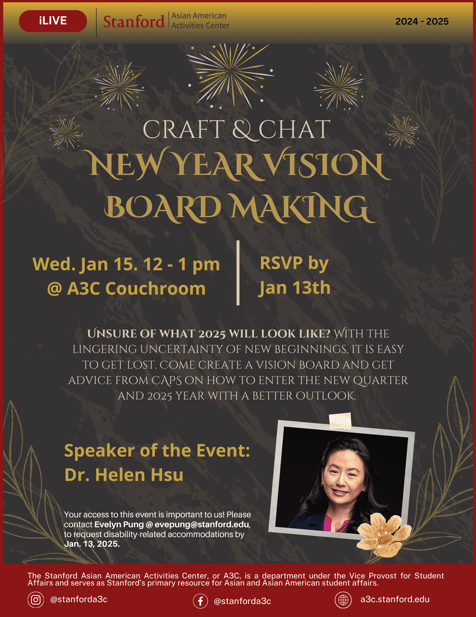
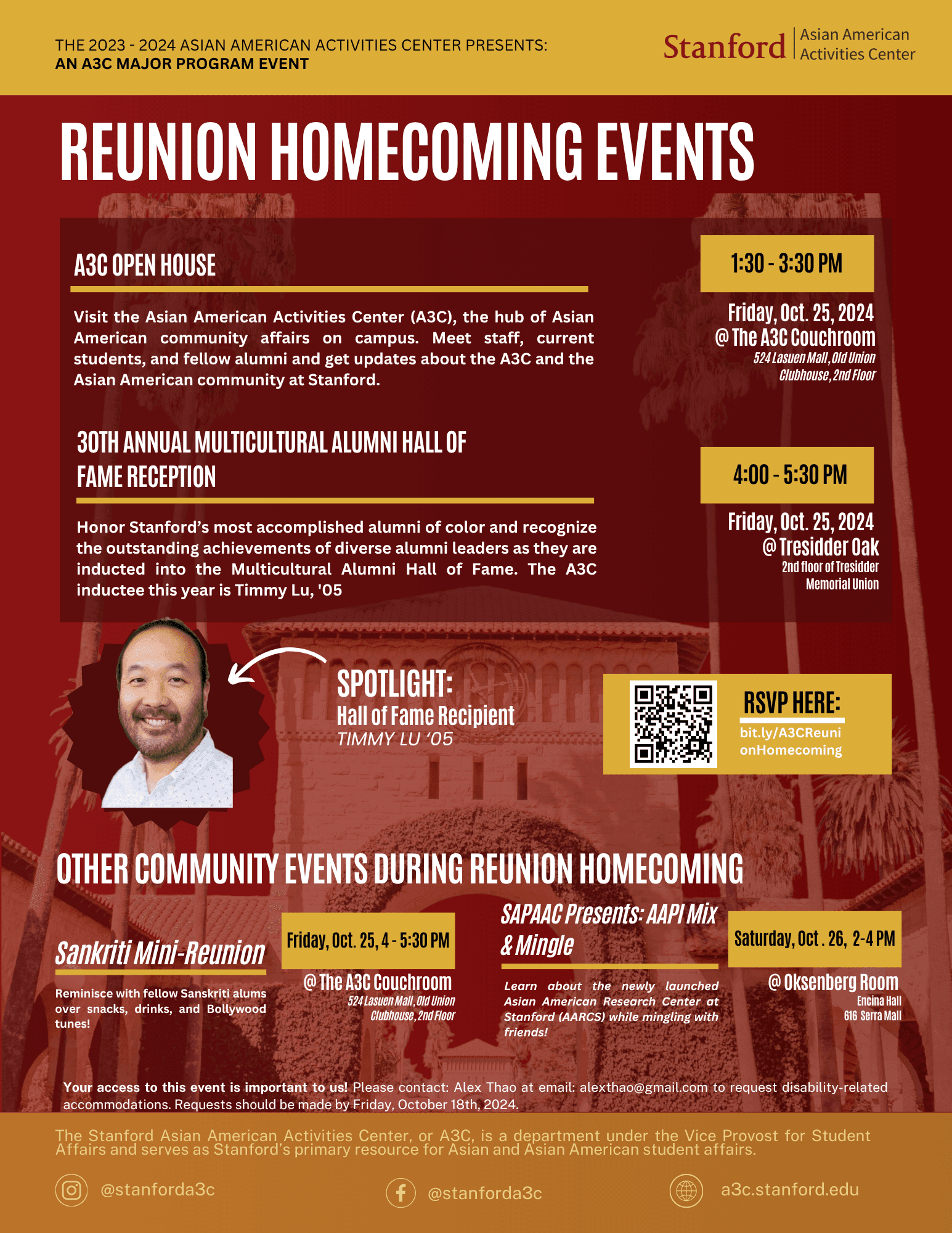
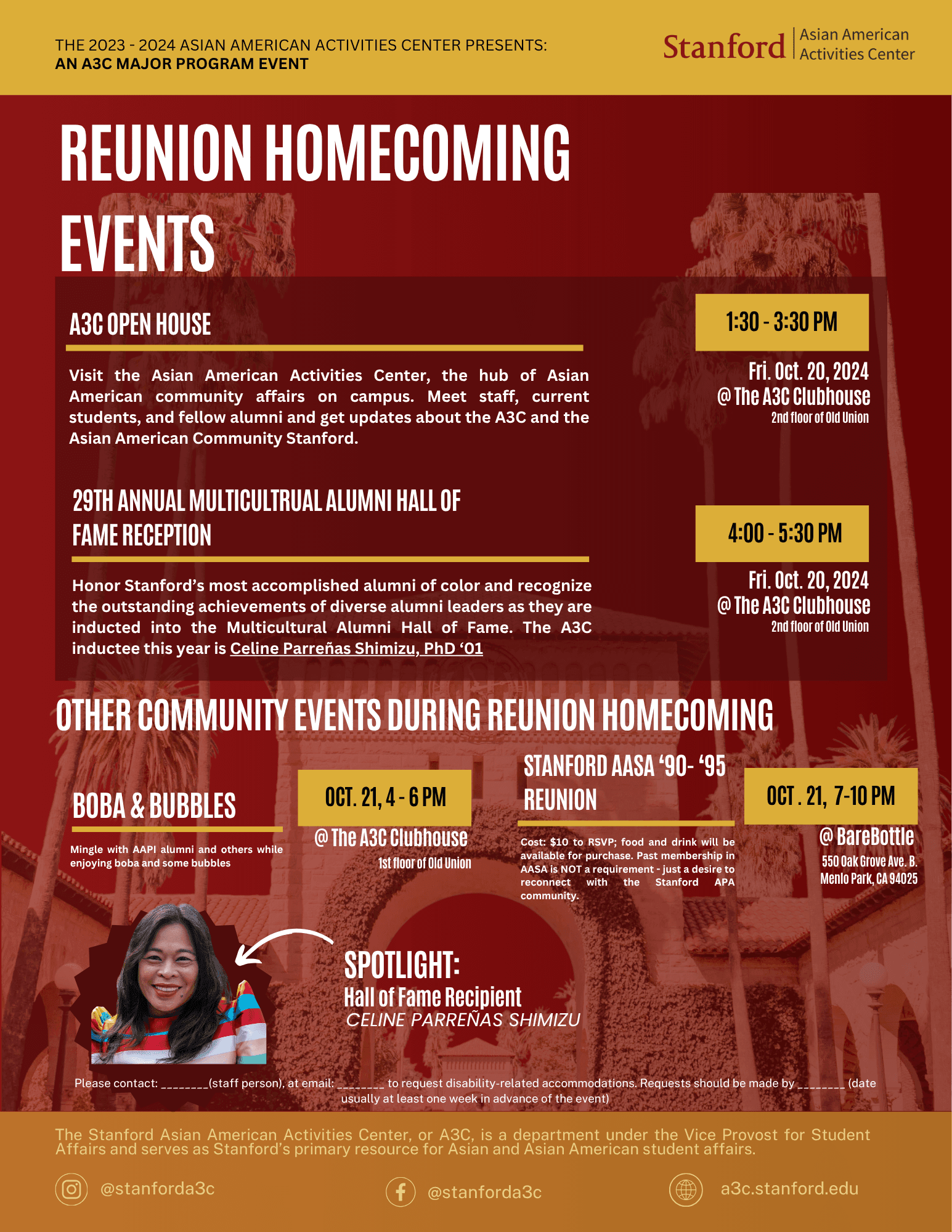

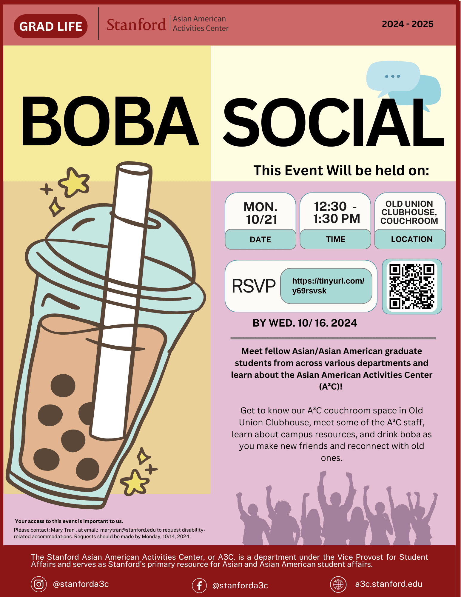


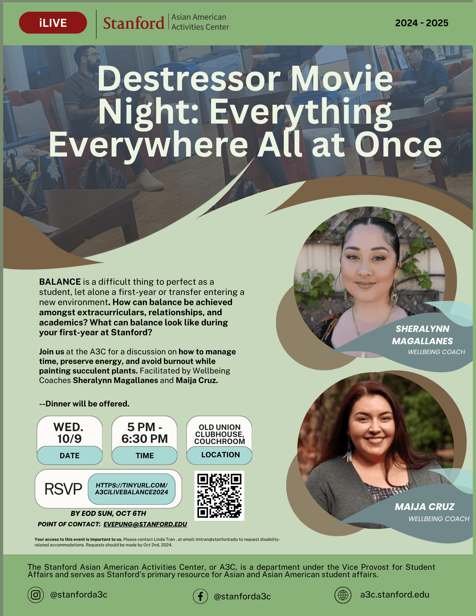
The resulting system reduced design turnaround time, strengthened A3C's visual identity across campus, and made it easier for students to recognize and engage with the organization's programming. More importantly, it transformed design from a series of one-off deliverables into a scalable communication system that could continue evolving with the community.
Lessons
Leadership Skills & Design Balance
Through this experience, I gained a lot of experience creating and managing an initiative from start to finish. Additionally, I earned to balance creativity and consistency in visual design.
Teamwork was also super important. Not only were there the main faculty, there were also multiple student employees that organized and fun each of the events. Learning to work in a such collaborative space with strict timelines really helped me be more disciplined and be proactive with communication.

