
USER INTERACTION AND EXPERIENCE PROJECT
Fizz Marketplace Experience
Role
Context
Tools
Skills
Product Designer
Project Manager
4 Designers
October - December
2025
Figma
Figjam
Procreate
UX/UI Design
UXR and Testing
Product Thinking
Visual Design
Design Systems
————————————————————————————————————————————————————————————————-
OVERVIEW
OVERVIEW
In a collaboration between Fizz and Stanford d.school, the university's design school, I served as a Leading Product Design Consultant on this project aimed at reimagining the Fizz Marketplace to help users discover and confidently sell everyday items within their college communities. While leading, mentoring, and managing designers on the team, I specifically focused on designing a comprehensive listing creation experience for sellers and a updated main explore page that minimized cognitive load and increased engagement.
THE PROBLEM
OVERVIEW
In a landscape shaped by fast-evolving marketplace technologies and rising user expectations, Fizz must evolve to remain relevant, competitive, and indispensable to student communities.
THE PROBLEM
THE PROBLEM
Fizz is a campus-first social marketplace that enables college students to safely buy, sell, and discover everyday items within their local university communities. Our task was to redesign the Fizz Marketplace to improve item discovery and seller confidence by simplifying listing creation and optimizing the main explore experience. This led us to formalize this central focus question:

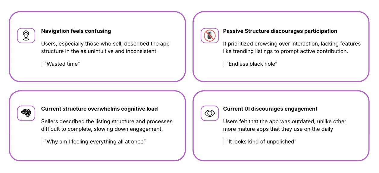
USER RESEARCH
THE PROBLEM
Interviewing 30 Fizz users to uncover friction in marketplace discovery, purchasing, and selling experiences
THE PROBLEM
Our goal was to uncover friction in the marketplace discovery and selling journey, and identify the factors that drive—or hinder—user participation. We synthesized our findings into an affinity map, which revealed the following key insights:
TEAM COORDINATION AND OWNERSHIP
THE PROBLEM
Taking ownership of leading designs to enhance product discovery and Seller engagement
THE PROBLEM
I owned end-to-end project execution, serving as both Lead Product Designer and Project Manager—driving design direction, assigning tasks, managing timelines, coordinating mentor feedback, leading team meetings, and producing stakeholder presentations. Alongside this, I led the design of a comprehensive listing creation flow and a redesigned explore experience to reduce cognitive load and increase engagement.
IDEATION
THE PROBLEM
Exploring possibilities
THE PROBLEM
To define feature directions, we facilitated a team sketching session to generate, critique, and refine ideas for improving item discovery and the seller experience.

ITERATION
THE PROBLEM
Prioritizing high-impact, feasible features and designs
THE PROBLEM
Following low-fidelity exploration, I strategically identified three key intervention points within the Fizz experience that would most effectively improve seller confidence and discovery. I then took full ownership of designing these features, leading mid-fidelity exploration across listing creation, explore, and seller visibility flows.
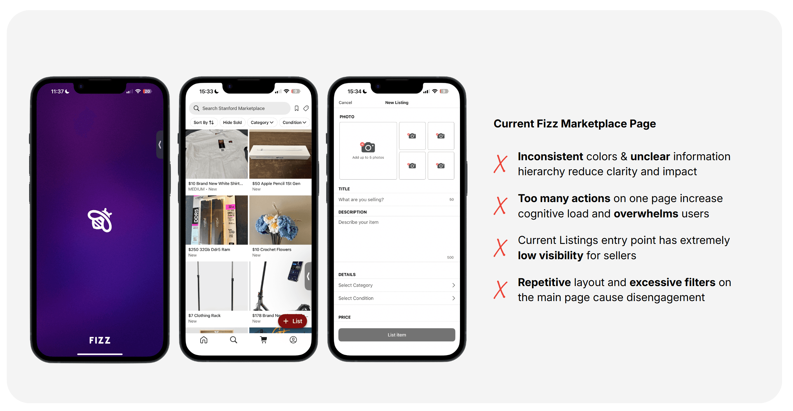
The current Explore and My Listings page
THE PROBLEM
The current Fizz marketplace interface is structured around a standard grid layout showcasing products, with categories and filters accessible from the sidebar and navigation menus. I aimed to redesign it to create a more engaging, user-friendly experience that lessens visual fatigue.
Elevating browsing experience through product cards
THE PROBLEM
I began by exploring multiple product card designs to elevate the standard, plain layout of the current interface. My choices were guided by how clearly and effectively the information—such as title, price, and filters—was presented. Ultimately, I selected the option on the far right for its balance of readability, organization and relevance.

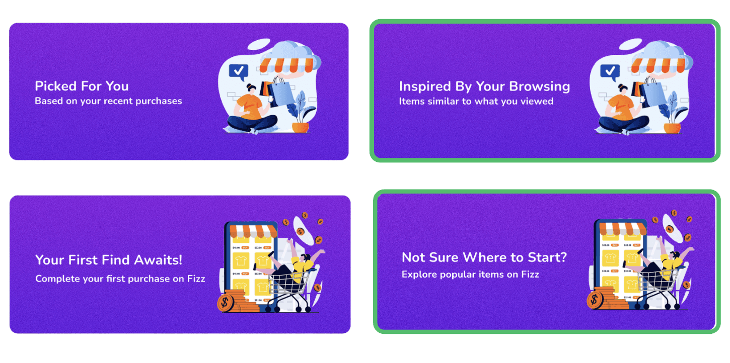
Introducing personalization and engaging experiences with AI
THE PROBLEM
The current interface offers little opportunity for personalization and limited ways for the app to engage users beyond basic filtering and item layout. In my redesign, I addressed this by introducing discounts and personalized browsing. By interacting with a product card, users can view items with recent price drops as well as a curated list of recommendations based on their previous activity.
THE PROBLEM
Discounts and Recommended for You Experience

THE PROBLEM
Recommended Browsing VS Purchasing Experience
At the intersection of encouraging purchases versus promoting browsing, I chose to emphasize browsing, as it enhances discovery and sparks curiosity. Pushing users toward immediate purchases tends to create friction and interrupts their flow.
THE PROBLEM
Opportunities for AI integration
At the intersection of encouraging purchases versus promoting browsing, I chose to emphasize browsing, as it enhances discovery and sparks curiosity. Pushing users toward immediate purchases tends to create friction and interrupts their flow.

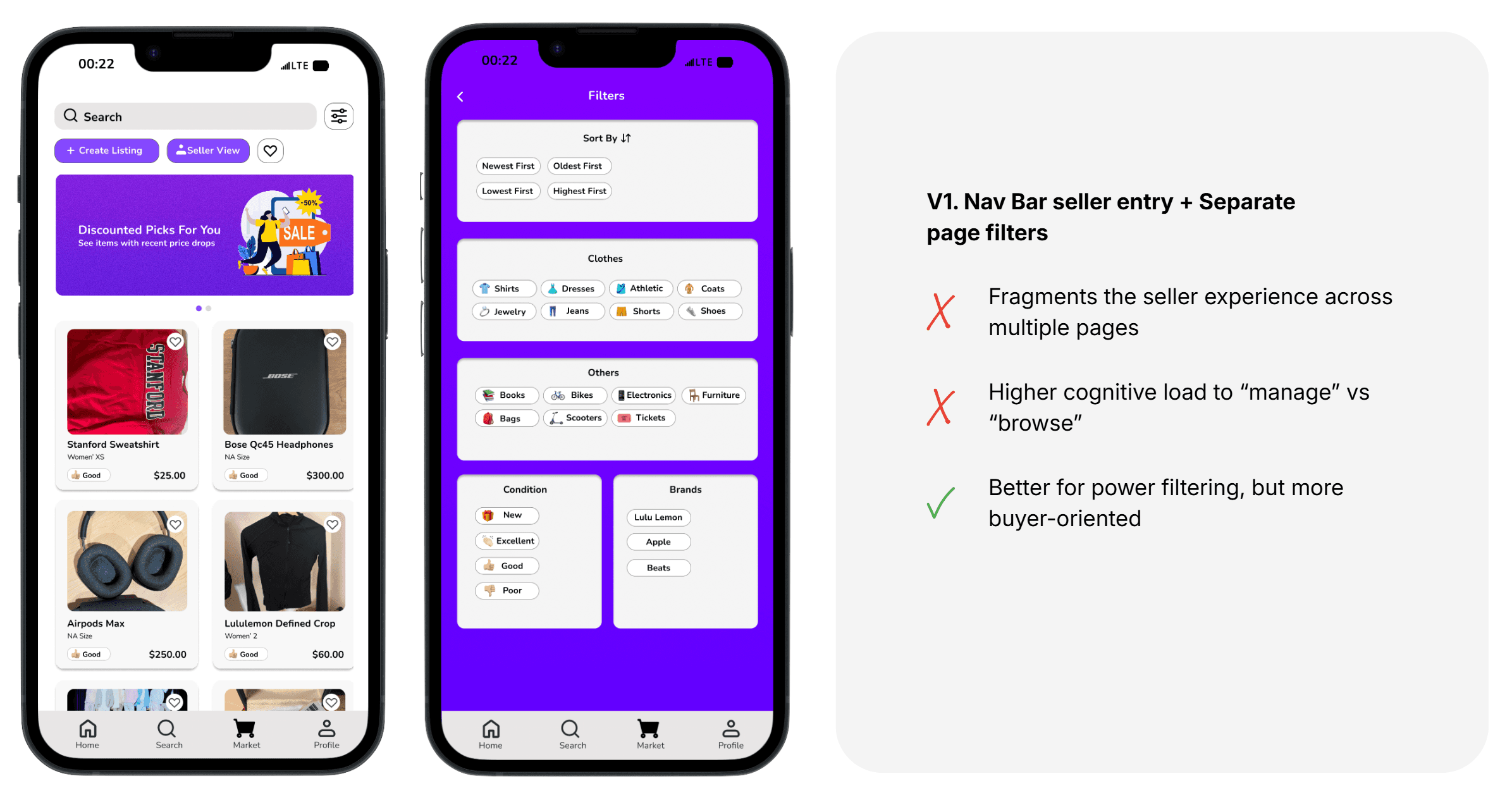
Streamlining Listing experience for Sellers
THE PROBLEM
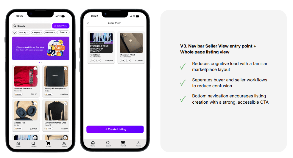
To explore the listing experience and explore page layout, I tested various iterations, including the three presented below. After evaluating these options based on usability, I chose version 3. From a seller’s perspective, Version 3 best supported fast, low-friction listing management by providing persistent access to seller tools without disrupting marketplace browsing. This design balanced seller efficiency with the dual buyer–seller nature of users, making selling feel lightweight, accessible, and repeatable.

Relieving cognitive load with multi-page processes
THE PROBLEM
To address the pain point of cognitive overload while creating a listing, I saw the opportunity to design a flow that separates the tasks to different pages. This allows users to automatically focus on one task at a time, while also knowing ahead how many pages they need to go through.

Fizz Marketplace Final Designs
Good designs guides users
This project reinforced that good design should empower users instead of limiting them to only a few, directed choices. Rather than prescribing actions, design should guide users toward making informed decisions. For both shoppers and sellers, the experience succeeds when decisions feel clear, confident, and seamless.
New sketches to improve and simplify the original user flow.
Building products 0 to 1 requires a lot of PM skills, especially in a group project
Big projects with big ambitions/ideas behind them are built faster when there's a streamlined and organized way to distribute work, view/edit timelines, hold accountability, and meet deadlines. I found that I was the one who had to monitor and manage the group's calendar and expectations throughout this project. It taught me that being a good designer also meant being comfortable leading people through different parts of the project for a smoother building time.

Thanks for stopping by! Let us get in touch!
Or email syan204@stanford.edu